Many projects start here. Even some that seem to get off to a great start can run into colour trouble. It can be difficult to come up with colour combinations that really work for your piece but with a little help from your colour wheel, you’ll be on your way in no time. Below is a very brief overview of some colour wheels and systems and here’s a great article on the history of the colour wheel.
Early Colour Wheels & Systems
Early Wheels & Spheres
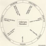
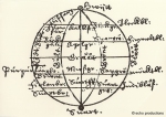 Aron Sigfrid Forsius was a Finnish astronomer, priest and NeoPlatonist. In a previously undiscovered text, he set out a system of colour that included his diagrams. One diagram presents a colour sphere that arranges colours by opposing pairs: red and blue, yellow and green, and white and black. His diagrams date from 1611 but lay undiscovered in the Royal Library in Stockholm until until the 20th century; they were unearthed and presented before the first congress of the International Colour Association in 1969. Robert Fludd, produced the first printed colour circle in 1630 (printed in a medical journal). The hand-drawn circle consisted of black, white, red, yellow, orange, green and blue.
Isaac Newton’s Colour Circle
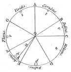 However, Sir Isaac Newton is generally credited as the first person to take a bar of colour and bend it into a circular form to study colour (1704). He preserved the proportions of colour that he observed as he passed white light through a prism, in his circular representation. His colour segments were not equal but sized according to their wavelengths and widths in his observation of the spectrum. This colour circle gave researchers and artists a new visual perspective on colour and new ways to think about how hues relate to each other.
Today, use of the colour wheel is a standard. It’s basically a way of showing colour that takes the rainbow and bends it around to make a complete circle or wheel. The wheel helps us to visualize the hues and easily shows how they relate to one another, as well as how mixing two or more colours produces new colours. Simple wheels show pure colours, which are hues that don’t contain any black, white or grey. More complex wheels can show pure colours along with tints (adding white), shades (adding black), and tones (adding grey).
Mayer’s Colour Triangle
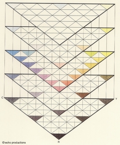 German astronomer and mathematician, Tobias Mayer, gave a lecture in 1758, in which he attempted to identify the exact number of colours the eye could perceive. He stated that there were 12 gradations between each colour, having chosen red, yellow and blue as his primary colours (vermillion, massicot and azurite among pigments), with white and black only involved in lightening or darkening colours. They weren’t colours themselves, but “agents” of light and darkness. He believed that different colours only became visible to the eye when 1/12 of a colour was mixed with a primary, so red plus 1/12 yellow would yield a new visible colour to the eye. No new colour would be visible until you got to red plus 2/12 yellow. In Mayer’s system r12 (12 units of red)=red, r6y6=orange, b6y6=green, b6r6=violet, etc. In his system, there were 91 colours created by these formulas. In 1775, Mayer’s colour triangle was published.
Traditional or Pigment Colour Wheel
Harris’ colour wheel
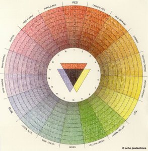 The Natural System of Colours by English entomologist and engraver Moses Harris, attempted to understand the relationship between colours and how they might be coded. In his book, Harris wanted to demonstrate that a multitude of colours could be created from three basic ones, red, yellow and blue. He was building on the work of Jakob Christof Le Blon, a German-born painter and engraver, who was the first to use metal plates (one for each individual colour) in the making of prints with continuous gradations of colour. Le Blon’s three main, or primary, colours were red, blue and yellow, with black used for outlining shapes. His colour theory formed the basis for modern colour printing, however he did not use a fully organized colour system. Harris built on Le Blon’s work to create his first printed colour circle in 1766.
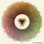 He made a distinction between his primary – “prismatic or primitive” (by which he meant unmixed red [cinnabar], yellow [King’s yellow, an artificial orpiment] and blue [ultramarine] pigments) – colours and compound colours, creating colour circles for both (primary to the right, compound to the left). Harris mixes his colours so that one of the two colour is predominant, giving rise to distinct colours like orange-red and red-orange. He further divided wheel into 20 saturation levels for each colour, rendering a wheel with 360 colours on it. Green, orange and violet are the main colours on the compound circle, mixing to form tertiary colours of olive, brown and slate. Through his mixing formula, he presents 15 additional shades and again divides the wheel into 20 levels of saturation. In total, his wheels showed 660 colours. However, Harris’ most important contribution was to visually demonstrate subtractive colour by showing that black is formed when red, blue, and yellow pigments are equally mixed at full strength.
Chevreul’s colour wheel
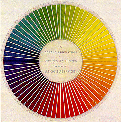 Michel Eugène Chevreul was a trained chemist who became involved with the process of dyeing when he was appointed as the director of carpet manufacturer, Gobelin. He noted that the colours of the dyes often did not have the effect desired and that this was due to optics and not chemistry. In 1839 he produced his seminal work, De la loi du contrast simultané des couleurs, to provide provide a systematic way to see colours, where he dealt with the “simultaneous contrast” of colours. His work underlined the active role the brain has in the perception of colour. He showed that a colour will give the colour next to it a complementary tint, so that yellow next to green will receive a violet tint. This is where he stated that:
Two adjacent colours, when seen by the eye, will appear as dissimilar as possible.
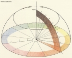 Chevreul developed a 72-segment colour wheel where there are 12 main colours in each segment, further dividing into 6 zones. Each colour is divided into 20 sections to indicate the levels of brightness. He designed a 3-dimensional colour circle (right) that showed the 20 levels of brightness on the flat plane – in the drawing you can see the orange moving toward white. However, rising from the center is a line representing black and it forms an axis with the colour that is broken into 10 segments showing the colour becoming darker. The numbering system indicates that 0N (N for “nero” or black) is the pure colour and it moves toward black in increasing increments of “N” until 9N is almost black (9 parts black with 1 part colour) and 10N would be black.
Goethe’s colour wheel
Johann Wolfgang von Goethe made his own observations about colour that challenged some of Newton’s observations. His Theory of Colours, published in 1810 made note of phenomena such as coloured shadows, refraction, and chromatic aberration. Goethe did not see darkness as the absence of light, but as a polar opposite that interacts with it, causing the sensation of colour.
Modern natural science sees darkness as a complete nothingness. According to this view, the light which streams into a dark space has no resistance from the darkness to overcome. Goethe pictures to himself that light and darkness relate to each other like the north and south pole of a magnet. The darkness can weaken the light in its working power. Conversely, the light can limit the energy of the darkness. In both cases color arises.
(Steiner, Goethe’s World View, Chapter III The Phenomena of the World of Colors, 1897)Yellow is a light which has been dampened by darkness;
Blue is a darkness weakened by the light.
(Goethe, Theory of Colours, 1810)
Goethe’s observations with a prism showed him that light did not split into seven continuous rainbow hues but that the beam had a red edge, turning to yellow, which became white in the middle until it passed into green shades that darkened to blue along its other edge. He did two experiments to prove his theory that colour resulted from the interplay of light and darkness – a light beam in a dark room and a dark beam (shadow) in a room filled with light. 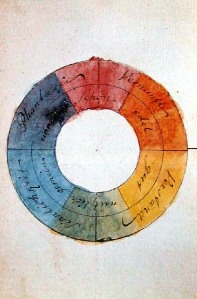 He observed that when the beam was white and the room was dark, the top edge of the beam was red shaded to yellow (red along the edge, moving to yellow inside the white beam) and the bottom edge was violet shaded to blue (violet at the edge, moving to blue inside the beam). Where the beam was narrow enough to allow the red-yellow and violet-blue edges to overlap, he observed green in the overlap. Where the beam was shadow and the room was light (dark spectrum), he observed that blue shaded to violet at the top edge of the beam, and yellow shaded to red along the bottom edge. Where they overlapped, magenta was the result. In both cases, he found that the yellow and blue remain close to the sides which are light and the red and violet remain close to the edges that are dark.
Newton’s colour wheel contained the seven colours of the rainbow that he observed. Goethe proposed a 6-colour symmetric wheel where the colours were diametrically opposed to each other, as they “reciprocally evoke each other in the eye. Thus, yellow demands violet; orange, blue; red, green; and vice versa: thus… all intermediate gradations reciprocally evoke each other; the simpler colour demanding the compound, and vice versa.” (Goethe, Theory of Colours, 1810) This opened the way to colour wheels with harmonious and complementary relationships.
Runge’s Colour Wheel
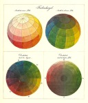 Around the same time as Goethe, Phillip Otto Runge, a German painter and draughtsman, developed his model of 3-dimensional colour spheres. Runge was interested in colour relationships and felt that artists had been abandoned by scientists because scientists seemed to be solely interested in the properties of colour that related to refracted light. His spheres arranged colours by hue and also included black and white, introducing tones, shades and tints into his colour system.
Itten’s Colour Wheel
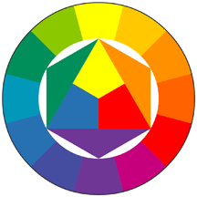 There are a number of different models for the colour wheel but the one that you may be most familiar with is the Itten colour wheel (on the left). Johannes Itten was a Swiss painter, textile designer, teacher, writer and theorist, and a contemporary of Paul Klee and Wassily Kandinsky. He studied under Adolf Hölzel, a German artist and painter, before joining the Bauhaus in 1919. Among Itten’s many contributions as a colour theorist is his consideration of the psychological characterstics of colours; he felt that characteristics of a colour could influence how a person feels when they perceive that colour. He believed that people didn’t need training to find their own “subjective colours.”
One of his major contributions was on the colour wheel. This 12-colour wheel is his expansion of Hölzel’s colour wheel and it uses red, yellow and blue as its primary colours. There are also 3 secondary colours (mixing the 3 primary) of green, orange, and violet and 6 tertiary colours (mixing a primary with a secondary colour), which are red-orange, yellow-orange, yellow-green, blue-green, blue-violet and red-violet.
Rood’s Colour Wheel
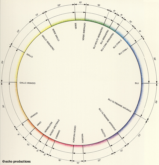 The first colour circle based on primary colours of red, blue and green was developed by Ogden Nicholas Rood, an American physicist. Rood was also an amateur painter and he was able to combine scientists’ research with the way artists used colour in his colour system. His system used a 12-colour wheel with concentric rings that progressed toward white as the colours moved toward the centre. The colours on his wheel are red, orange, orange-yellow, yellow, green-yellow, green, green-blue, cyan, blue, ultramarine-blue, violet and purple. He also drew a colour wheel with the angular positions of the colours as used by painters (left).
Rood was interested in additive colour mixing and, working to improve on the colour triangle of Scottish physicist James Maxwell, he used spinning colour tops in to simulate mixing coloured light; he is probably the first writer to clearly differentiate between additive and subtractive colour mixing systems in terms that everyone could understand. He was also the first to define the attributes of hue, saturation and value, which have become crucial to modern color systems.
RGB Colour Wheel
The RGB (Red, Green, Blue) colour system arises when we’re talking about effects of light (frequencies the human eye & brain perceive as coloured) rather than pigments or dyes. Red, green and blue are not determined by nature to be primary colours, but by the our physiological repsonse to light; the way the eye receives and interprets wavelengths of the visible spectrum. Cones are photoreceptor cells in the retina of the eye that transmit light into electrical signals that the brain can interpret, and they are responsible for our perception of colour.  Humans typically have three types of cone cells. The L (for Long) type that distinguishes long wavelengths (in the red range), M (medium-wavelength) that responds to wavelengths in the green range, and S (short-wavelength) that responds to blue and violet wavelengths. Our sensation of colour is due to the mixture of these three colours.
This system of mixing light is known as additive colour. Additive colour begins with black, as the absence of visible wavelengths (therefore having no colour) and coloured light is added to it. In the case of inks, you are subtracting from white light so that if you add your primary colours together equally, and at full strength, you end up with black. With additive colour, the more coloured light you add, the closer to white you get. If you add red, green and blue together equally, at full strength, you will end up with white light. You can produce a subset of colours by varying the ratio of coloured light mixed, as well as the luminosity. [A note: Additive color is a result of the way our eyes detect color, and is not a property of light. 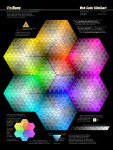 There is a difference between yellow light, with a wavelength of approximately 580 nm, and a mixture of red and green light. However, both stimulate our eyes in a similar manner, so we do not detect that difference.]
If you are working with colour on the web, then you are working in an RGB model. Hex colour values, such as those in the Visibone chart on the right, are based on RGB colours.
Process Colour Wheel
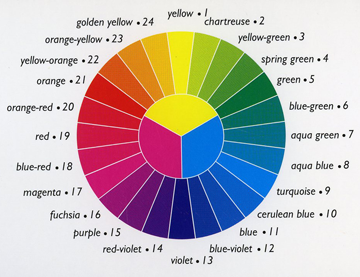 I use the 3-in-1 Colour Tool by Joen Wolfrom which is based on the Ives colour wheel (on the right). I’ve found that this 24-colour system gives me enough pure colours without becoming overwhelming.
The Ives colour wheel uses magenta, yellow and cyan/turquoise as its 3 primary colours. This system is the basis for dyeing textile and the CMYK system used in printing (K is for black). The Ives wheel will give you slightly different complementary colours (colours that lie opposite each other on the colour wheel) from the Itten wheel.
This system is known as subtractive colour and creates colour as the dyes, paints, inks or films absorb some wavelengths of the visible spectrum and reflect others. The subtractive system starts with a white reflective surface (like paper) or white light and colourants like ink or film are placed on or in front of the reflective surface or light. The colourants subtract light frequencies or wavelengths from the white source to create colour.
The three primary colours of light are red, green and blue (discussed further below); when combined equally at full strength, they produce white light. A colourant (let’s say, ink) that absorbs all the red light (the frequencies our eyes perceive as red), leaves blue and green visible. At full strength, we perceive the result as cyan. When green light is fully absorbed, blue and red are visible, which we perceive as magenta. We perceive yellow when blue light is fully absorbed and red and green light is visible. Cyan, magenta and yellow are the “control” colours of the subtractive system because when two of them are mixed equally at full strength, they produce a primary light frequency; this allows for subtractive control (taking away from white light) of the three primary colours. So, when a newspaper wants to run a red headline, they use yellow and magenta ink. When I create a promotional card with a pure blue background, my printer mixes cyan and magenta to produce it.
The full strength of cyan, magenta and yellow mixed equally will produce black. (In printing, as mentioned above, black ink is added, giving you the CMYK system.) Greys are produced by equally mixing each colour at lesser strengths. Varying the amount of each colour and the ratio of colours mixed produces most of the other visible hues and hue families.
Real Colour Wheel
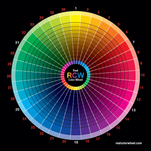 The Real Colour Wheel was developed by Don A. Jusko and brings together colours of light, pigments and crystals. Jusko has exhaustive listings matching paint colours to RGB values, pigments and crystals to his colour wheel, elements to the colour wheel, etc. The primary colours are yellow, magenta and cyan, as Y=yellow in his system, M=magenta, C=cyan and red is YM, blue (or ultramarine) is MC and green is CY. His colour system matches RGB tints, but it differs from the RGB system as colours get darker (because pigments darken differently). So instead of yellow darkening to black, on his wheel it darkens to brown, and cyan darkens to dark blue.
Information compiled from:
Pingback: Web Rgb Color Wheel | All Wheels Blog
Pingback: Ives Color Wheel | All Wheels Blog
Pingback: Hex Color Wheel | All Wheels Blog
Pingback: Colour Wheels & Colour Systems | 2D Design